Get formatted versions: Word : PDF
Orientation
The statistical work we do is built around models. If the word “model” reminds you of a toy plane, you’re on the right track. A model is something we build in order to represent something in the real world. Usually the model is much simpler than the real-world object.
Models are useful when they serve a purpose. For instance, a toy plane can serve the purpose of teaching a child what are the main components of a plane and how they are related.
Many of the models built by statisticians are for the purpose of summarizing the relationship between variables. The modeling framework we are using (think modeling clay or balsa wood or a 3-d printer) involves a single response variable as output and one or more explanatory variables as input. One purpose for a model is description: if the input changes by a certain amount, how much does the output change.
Another important purpose for a model is to help us gauge how much of the variation in the response variable is accounted for by the explanatory variables. Knowing this guides conclusions about whether the explanatory variables are important in shaping the response variable. Or, looking at things the other way, knowing how much is accounted for also tells us how much remains unaccounted for.
That’s what this lesson is about. As you’ll see, we’ll work with a statistic called R with the long-winded name “coefficient of variation.” (When you read about statistical models, you’ll generally encounter the square of R, called “R-squared” and written R2. There’s a good reason for that, but it’s not important now.)
Activity
The first step in finding out how much of the variation in the response variable is accounted for by the explanatory variables is, perhaps obviously, to measure how much variation there is in the response variable. Open the LA_linear_regression Little App (See footnote1), choosing the
Births_2014data frame, setting the response variable to beage_fatherand the explanatory variable to beage_mother.The graph that will be displayed will look like this (although your random sample will be different):
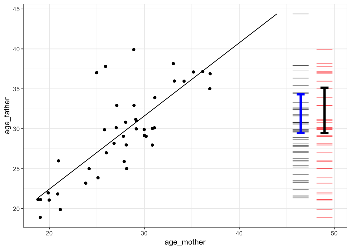
The red bars on the right end of the graph show the values for the response variable. There is one bar for each dot in the graph (although they may overlap). Note that the explanatory variable isn’t involved in the red bars, the bars are just about the response variable. The variability in the response variable is the amount of spread of the red bars. One not very reliable way to measure the variability is to look at the range of the variable, the difference between the biggest and smallest value.
There is a measuring stick in the app for measuring vertical positions and differences. Use the mouse to click on the graph and drag up or down to highlight a region. When you release, the app will show the value of the response variable at the top and bottom of the highlighted region. It will also show the difference between top and bottom.
Use the measuring stick to find out the difference between the maximum and minimum value of the response variable. Write down the difference you found. . . .
Another way to quantify the spread of the red bars is with the standard deviation. The black I-shaped mark spans a vertical distance of one standard deviation.
Use the measuring stick to measure the length of the standard deviation mark.
Write down your measurement of the standard deviation. We’ll call it “total”. . . .
The range and the standard deviation are different quantities. Both describe the spread of the response variable, but they do so in different ways. You could use either, but the standard deviation is a more reliable way to measure the variation, so that’s what we generally use use.
The Little App automatically shows the best-fitting straight-line description of how the response and explanatory variable are related. This is called the regression line. For every position on the x-axis, the regression line gives a corresponding position on the y-axis. Since the x-axis shows the explanatory variable and the y-axis shows the response variable, the straight line is a way of translating from the explanatory variable to the response variable. The actual data points are not usually exactly on the regression line, because the explanatory variable offers only a partial explanation for the response variable.
To measure the amount of the response variable accounted for by the explanatory variable, use the bars next to the red bars. Remember the red bars showed the actual values of the response variables. The bars are different. They show the values for the response variable that you get when you use the line to translate the explanatory variable into a value for the response variable. These values are called the “model values.” There is a blue I-shaped mark over the bars that shows the standard deviation of the model values.
Measure the variation of the model values with the standard deviation. You can use the measuring stick to figure out how long the blue mark is.
Write down that number, calling it “explained.” . . .
The answer to the question, “How much is accounted for?” is the ratio of “explained” divided by “total.” This ratio is called R.
What’s the numerical value of R when using the standard deviation to measure variation? . . .
For the graph shown above, R is about 0.6. As you can see, there is a pretty strong relationship between mother’s age and father’s age. You probably know the sociology of this: people tend to partner with someone of a similar age. It’s not quite right to say that mother’s age causes father’s age. That’s why we say that R is a measure of how much of the response variable is accounted for by the explanatory variables.
Use the Little App to explore the relationship between response and explanatory variables that you choose.
- Find a pair of variables that have a large R. Write the names of the variables here. . .
- Find a pair of variables that have a small R. Write the names of the variables here. . .
Select three variables: a response and two explanatory variables. The app calls the second of the explanatory variables a covariate.
- Find an example where including the covariate increases R. Write down the names of the response, explanatory, and covariate here. . . .
- See if you can find an example where the covariate decreases R. (Hint: If you make a few attempts, you’ll get a good idea of what’s going on.) What did you find? . . .
You might have encountered a close relative of R, written r (little-r) and called the “correlation coefficient.” Little-r only makes sense when there is only one explanatory variable, that is, no covariate.
Play around with a few examples of pairs of variables and figure out what’s the relationship between r and R. (Hint: Look at the slope of the regression line.)
Describe the relationship you observed. . . .
Version 0.1, 2019-05-29, Helen Burn & Danny Kaplan, Word version