Get formatted versions: Word : PDF
Orientation
Graphical displays are effective when they connect well with human visual and cognitive faculties. Humans are extremely good at some visual tasks and surprisingly poor at others. To illustrate, consider the task of identifying how many 3’s there are in the following list:
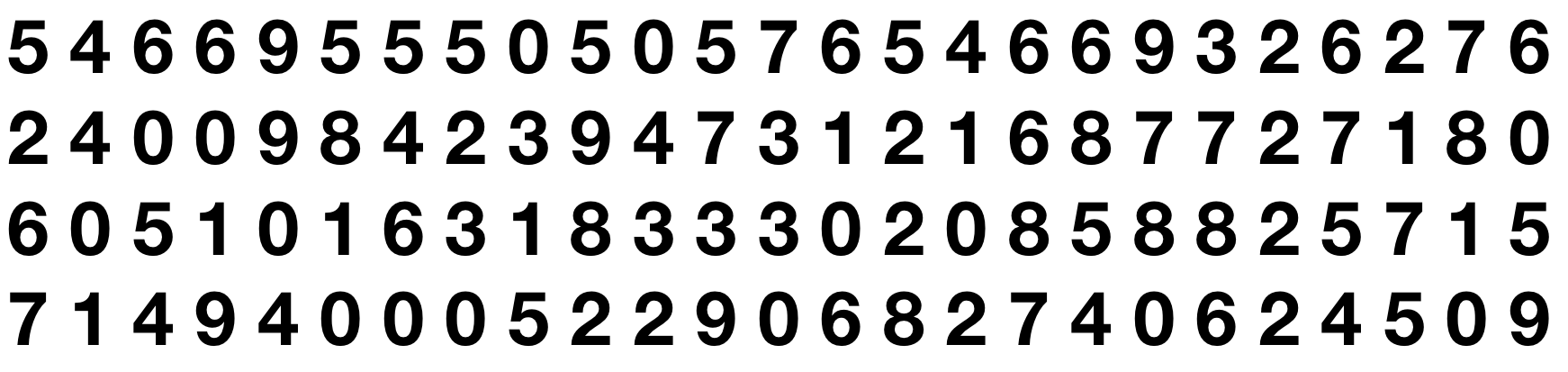
The task is difficult because recognizing shapes is a tough cognitive task.
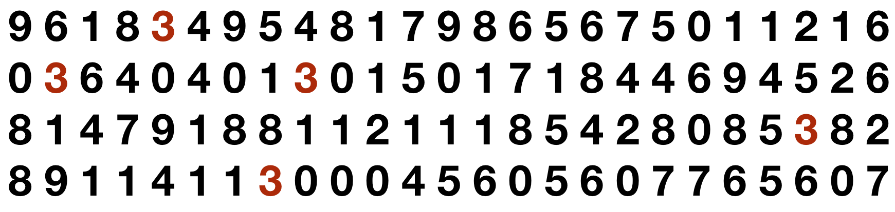
The task becomes much simpler if we take advantage of color, which our visual systems can process very quickly. Try finding the 3’s again:
One visual task that people are good at might be called “seeing the forest despite the trees.” When dots are scatter across a display, people can easily perceive differences in density from place to place. This despite the dots being all identical to one another.
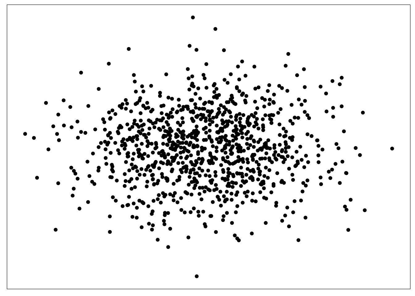
This human capacity to see density is one of the factors that makes point plots an effective way to present data.
Regrettably, when one or both of the variables in a point plot are categorical, all of the dots at each level of the variable line up; multiple dots can be exactly in the same place in the graph. This is called overplotting. We perceive this multiplicity as a single dot and cannot see changes in density for different values of the variables.
Jittering and transparency are techniques to modify point plots so that we can see the relative density for different values of the variable.
Activity
Open up the jittering Little App`. (See footnote1).
Select
NHANESas the data frame, withsexas the response variable andeducationas the explanatory variable. Leave the sample size a n = 50.Count the points in the image.
Are there n = 50 dots visible? . . .
Turn down the sample size to n = 5. There are now some places where there were dots for n = 50 but not for n = 5.
What’s going on at the places where there are not dots? . . .
Look at the “statistics” tab. This contains a table of the points being displayed. Is the number of rows in the table consistent with n = 5? According to the table, are there any combinations of variables for which there is more than one row? Press “New Sample” if necessary so that there will be at least one repeated combination.
Looking at the corresponding place in the graphic, is there any sign that the combination is repeated multiple times. . . .
Turn up the sample size to, say, n = 1000.
With n = 1000, can you tell which values of the variables are most common? Why not? . .
Leaving n = 1000, move the horizontal slider that controls jittering width from zero to a value of about 0.1. Notice what’s changed in the plot.
Move the vertical slider to move from zero vertical jittering to about 0.1.
Is it possible to tell which combinations of the variables are most common? If so, explain how. . .
Select n to include the entire sampling frame: all the data. This will put about 7000 points in the graphic.
Is it still possible to distinguish the relative frequency of the different combinations of the response and explanatory variables? . . .
Try changing the jittering sliders to make the differences in relative frequency more evident, while still keeping the square clouds of points separate.
Is your choice of jittering settings larger or smaller than it was when n = 1000 points were being displayed. . . .
Even with jittering, with large n there will be some overplotting. This is where transparency comes into the picture. Using transparency reveals such overplotting in terms of the perceived darkness of the display.
Turn down the transparency slider from 1 to a small value that makes it easy to see where there is overplotting. (Hint: Depending on the jittering settings you selected in (4), you might need to make the value of the transparency slider very small.
What are the values of the horizontal and vertical jittering controls and of the transparency control that make it easiest to distinguish the different density of data across the ten different variable combinations? . . .
Set the response variable to
income_poverty, which is quantitative. (Leave the explanatory variable aseducation.) And turn the vertical jittering to zero.Can you tell which values of
income_povertyare more common at the different education levels? Adjust the horizontal jittering and transparency to create a plot you think is effective at showing how the distributions ofincome_povertychange from one education level to another.Write down the horizontal jittering and transparency you think make the most effective graph. . . .
Tell the story shown by the graph using everyday English terms. . . .
Check the “show violin plot” box underneath the jittering controls.
Explain what is the relationship between the violin-like shapes and the density displayed by the jittered point plot. . . .
Version 0.3, 2019-05-29, Danny Kaplan, Word version