Get formatted versions: Word : PDF
Orientation
Data can be many things, but one of the most common formats is a data frame, a kind of spreadsheet of rows and columns. We’ll work with the data frame Births_2014, which is based on data published by the US Centers for Disease Control. Births_2014 has 100,000 rows. Each row reports a live birth in the US in 2014. There are dozens of variables, a few of which are shown below.
| sex | baby_wt | gestation | delivery | age_mother | wic |
|---|---|---|---|---|---|
| F | 3430 | 38 | spontaneous | 36 | n |
| F | 3203 | 39 | spontaneous | 32 | y |
| M | 3644 | 39 | vacuum | 20 | n |
| M | 3756 | 40 | cesarean | 33 | n |
| F | 4026 | 40 | spontaneous | 26 | y |
| M | 3285 | 40 | vacuum | 21 | y |
It’s hard to draw much of a conclusion by looking directly at a large data frame. But a graphical display of data can help.
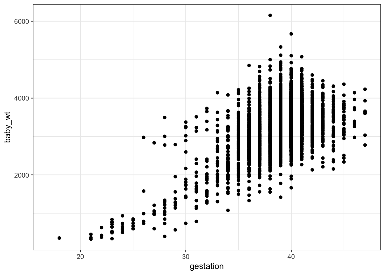
A point plot1 is a basic statistical graphic that displays two variables from a data frame. One variable is represented on the vertical axis, another variable on the horizontal axis. Like the following point plot of the baby’s weight (in grams) and the length (in weeks) of the pregnancy (gestation).
Exercise
Referring to the graph in the previous section …
- Find in the graph the dot corresponding to the first row in the data table above, the one for a male baby delivered spontaneously to a 28 year-old mother.
- Describe the overall pattern shown in the graph as a whole. Use whatever form of description you think is appropriate.
- Of course, weight differs from one baby to another. In other words, weight varies. Describe how much variation there is in babies’ weight, according to the graph.
- Describe how much variation there is in gestation length.
- At which length of gestation are the heaviest babies born?
Activity
Open the Point Plot Little App. (See footnote2).
Set the data source to
Births_2014. Choosebaby_wtas the response variable andgestationas the explanatory variable. The resulting plot should look much like the graph seen in the introduction to this lesson. Change the sample size to \(n = 5\).Open the “Statistics” tab under the main graph. This tab displays the same data as in the plot, but in data-frame format.
- For each of the \(n=5\) rows of the data frame, find the corresponding point in the graphic.*
Change the explanatory variable to
sex.For each of the \(n=5\) rows of the data frame displayed in the Statistics tab, find the corresponding point in the graphic.
Change \(n\) to 500. In the
baby_wtversussexgraph, all the points are lined up in two columns.
Explain why. . . .
Change the response variable to
delivery, keeping the explanatory variable assex.For a few of the rows of the data frame shown in the Statistics tab, find the corresponding point in the graphic.
Make sure that \(n\) is something large, say \(n = 500\). There aren’t 500 points in the
deliveryversussexgraph.
Explain why? . . . . .
Check the “jitter categorical variables” box in the controls. The display changes and now there are many more points in the plot.
- For a few of the rows in the data frame shown in the Statistics tab, find the corresponding point in the graphic.
Are you able to uniquely identify in the graph the specific point corresponding to each row? Explain how you can do this or why it’s not possible. . . . . .
Version 0.3, 2019-05-29, Daniel Kaplan, Word version
The word “scatterplot” is also used.↩