Activities
Learning objectives
- Understand how a distribution summarizes the properties of a collection of individual values.
- Be able to translate between major forms of representing distributions graphically, e.g.
- the density of points in a (jittered) point plot
- the presentation of such density as a height or width as in a violin or density plot
- Be able to eyeball the standard deviation of a close-to-normal distribution and, similarly, a 95% summary interval (that is, mean ± two standard deviations )
- Be able to identify common characteristics of skew or long-tailed distributions, by comparison to a normal distribution.
- Understand that there is a family of normal distributions, with each individual identified by its mean and standard deviation.
- Use technology to display the distribution of a variable from data.
- Relate an interval display (such as a 95% summary interval) to a display of the distribution.
- Understand that the relative frequency of two values is the ratio of the height of a density plot at those two values, or the relative width of a violin plot, or the density of ink at those two values in a jittered point plot.
Additional resources
Orientation for instructors
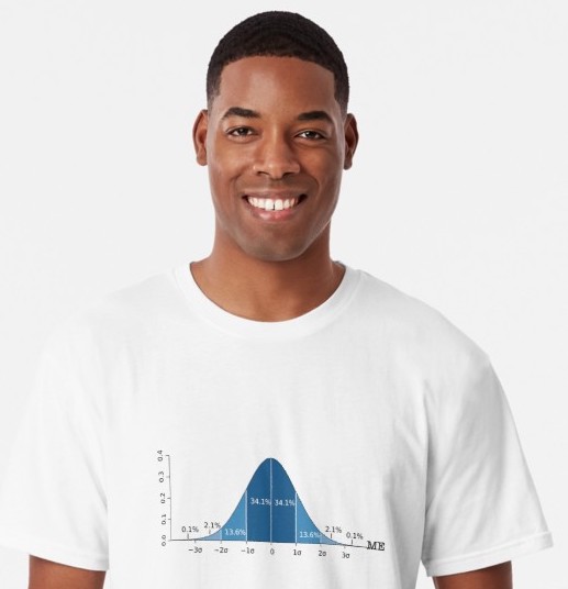
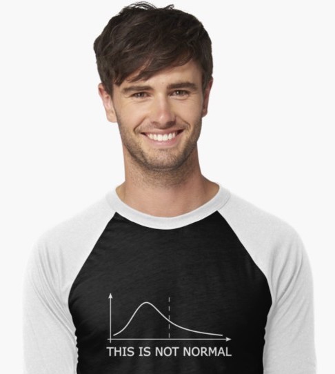
It would be hard to overstate the centrality of the normal distribution to statistics and to the introductory statistics course. It’s even got a cult following; for instance, you can buy a normal pillow or a t-shirt.


Role in statistical practice
Fundamentally, the normal distribution provides a standard for defining “extreme” and “middle.” We measure distance from the mean in terms of the standard deviation. A value two or more standard deviations from the mean is practically the definition of “exteme.” The conventions of inferential statistics – sampling distributions, sampling distributions under the null – are closely tied to the normal distribution. For instance, the choice of 95% for a confidence level or 0.01 for a p threshold are motivated by the normal distribution and standard deviation.
Of course, in a world of big data we could equally well define “extreme” directly in terms of the 2.5% and 97.5% quantiles of the data itself. Calculations of such quantities is problematic when there are just a handful of values and unreliable even with a hundred. So, for small data, the normal distribution provides the go-to parametric estimate.
The normal distribution is also important as a reference for the shape of distributions. Skew, long-tailed, etc. are best seen by contrasting them to a normal distribution (with the same mean and standard deviation).
There are many other ways that the normal distribution is used in statistics. Or, more precisely, many way in which it is mis-used. Let’s consider them in the misconceptions section.
Pitfalls
It’s almost impossible to untangle the mathematical object that is the normal/gaussian distribution from the social idea of “normal.” The terminology of statistics, established in the late 1800s and early 1900s with seminal contributions from avowed eugenicists (e.g., Galton, Fisher) was wrapped up in “normal” as it refers to “correct” or “usual.” Terms like “error” and “deviation” are close to their everyday pejorative sense.
It’s easy for students to come away from a statistics course with the misconception that the the normal/gaussian distribution is what’s to be expected for a well-behaved variable, e.g. the message of the t-shirt shown below.

Of course variables are what they are. Some of them have a distribution close to normal, others have a distribution far from normal. It’s important to demonstrate to students that legitimate variables often have a non-normal distribution. (Many of the data sets in the Little Apps have variables with skew distributions.)
The quantities in statistics that very often have a close-to-normal distribution are those often calculated from data, e.g. the sampling distributions of statistics such as the mean, median, …. That these sampling distributions are close to normal is what shapes confidence intervals and p-values. But keep in mind that a sampling distribution is not a variable found in data, it is a theoretical construct, the result of a thought experiment in which we disregard that we are usually working with a single sample and the corresponding value of a sample statistic (e.g. the mean), and instead imagine that we have a large collection of samples, each of which has it’s own value for the sample statistic and which, collectively, have a distribution.
Keep in mind the large cognitive distance between the usual bell-shaped display of the normal distribution and actual data. It can help students to make the journey by starting with plots of actual data, such as jitter plots. In these plots, density is represented by the literal density of ink on the page (especially when transparency is used). Then introduce violin-type plots on top of the data to show how they represent using length the density that can be seen in the ink. Finally you may want to show the conventional density curve on its own, but think about whether you really need to do this.
The density curve itself is a mathematical shorthand that makes it easy to sketch out what would otherwise require putting lots of dots on the page. It may be helpful to your students to remind them that the underlying reality is those dots, perhaps by annotating each density curve with some data dots, more near the high points of the curve and fewer at the low points.
Student pre-requisites
- Understand different format for graph: density versus value, as opposed to response versus explanatory or violin plot.
Assessment items
Simple drill on distributions:
- Is the frequency at value A bigger or smaller relative to the frequency at value B?
- Pick a value such that about 10% of the distribution is above that value.
- Is the distribution symmetric?
- Is the proportion of the distribution between A and B bigger/smaller/about-the-same as the proportion between C and D?
Show distributions of variables. For each:
- Ask whether the distribution is a close match to the normal distribution.
- If not, use an appropriate word description (e.g. left-skew) for the distribution.
- If so, estimate the mean and standard deviation from the graph.
Students see so much of the normal distribution that they tend to overgeneralize it. Some antidotes to this:
I examined historical records over the past 500 years of river flood heights in China, Egypt, and Europe I recorded, for each river, the year in which every flood happened that reached the level that we would now call a “hundred-year” flood for that river. Then I measured the time interval between successive floods on each river. Sketch out what you think the distribution of intervals between hundred-year floods.
Many students will draw a normal curve centered at 100 years. When they do so, some questions to ask them:
- How did you decide what the value of the standard deviation should be?
- On one of the rivers I noticed that it’s been more than 200 years since the last “hundred-year” flood. Is this possible, or must it be a gap in the records? According to the distribution you drew, roughly when will the next hundred-year flood occur? (Since the mass of the distribution is near 100 years, there’s little probability, according to the normal distribution, that another 100-year flood will occur. Does that make sense?)
One problem here is that the normal distribution is not appropriate. A better shape is an exponential distribution. Very short intervals between “hundred-year” floods are very common, balanced out by very long intervals.
**Imagine observing a carnival spinner, recording the number, 0 to 100, that results from each spin. You observe 1000 spins. What will the distribution of your observations look like?
Many students will draw a normal distribution, typically centered near 50. Ask them what this implies for a betting strategy and whether such a strategy is likely to make money. Then ask them for their common-sense evaluation of such a strategy.
If you teach calculus as well as statistics, you might be tempted to point to the inflection points if the normal curve. If you do so, it should be because you want to teach a lesson about inflection points, not about statistics.
Creating an active classroom
See the document on general tips for creating an active classroom.
- Directly engage the matter of how the meaning of “normal” in statistics is different from the everyday meaning.
- Ask students to think about the word “normal” means outside the statistics class.
- What’s a normal BMI?
- WHO definitions
- Does the range 20-25 contain most people?
- How big a range to contain 95% of people?
What’s a normal age to have a baby?
What’s a normal systolic blood pressure?
What’s a normal height?
Sticky note. Right down the oldest age at which they’d call a mother “young” (etc) – get the students’ various opinions out there in a way that’s visible to the students.